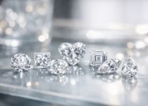
Diamond Proportions Chart Explained
A diamond can look bright on a product page and still disappoint in person. That usually happens when shoppers focus on carat weight, color, and clarity but overlook the geometry that controls sparkle. A diamond proportions chart helps fix that problem by showing the measurements that affect light performance, face-up size, and overall beauty.
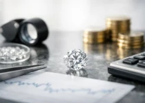
If you’re buying online, this chart matters even more. You cannot rely on store lighting or sales language. You need numbers that help you separate a well-cut diamond from one that only looks good on paper.
What a diamond proportions chart actually shows
A diamond proportions chart is a reference guide for the key measurements of a diamond’s cut. It usually includes table percentage, total depth percentage, crown angle, pavilion angle, girdle thickness, culet size, and sometimes star length and lower half length. These values describe how the diamond is built, not just how big it is.
For most shoppers, the chart is most useful for round brilliant diamonds because round cuts have the strongest research behind ideal light performance. Fancy shapes like oval, cushion, and princess also have proportion guidelines, but they are less predictable. Two ovals with similar numbers can still look very different in person.
This is why proportions matter so much. A grading report may tell you a round diamond has an Excellent cut grade, but that grade still includes a range. Some Excellent diamonds are outstanding. Others are merely acceptable. The chart helps you see where within that range a stone falls.
Why proportions matter more than many buyers realize
Cut is the engine of a diamond’s appearance. When proportions work together well, light enters the stone and reflects back to your eye in a balanced way. That creates brightness, fire, and scintillation. When the proportions are off, light can leak out of the bottom or sides, making the diamond look dull, dark, or smaller than it should.
This is where buyers often overpay. They may choose a higher clarity grade or a larger carat weight, while ignoring a weaker cut. In practice, a well-proportioned diamond often looks more impressive than a larger stone with mediocre geometry.
There is also a value angle here. Some diamonds carry premium prices because they hit highly desirable proportion ranges. That can be worth it, but not every buyer needs the narrowest ideal target. If your budget is tight, understanding the chart helps you know where you can flex and where you should not compromise.
The main measurements on a diamond proportions chart
Table percentage
The table is the flat top facet of the diamond. Table percentage compares that width to the diamond’s overall diameter. For round brilliants, many buyers do well focusing around 54% to 58%, with 55% to 57% often considered a strong zone.
A larger table can increase white brightness but may reduce fire. A smaller table can boost fire but may make the stone look different in balance. There is no single magic number, but extremes on either side deserve caution.
Total depth percentage
Depth percentage compares the diamond’s height to its average diameter. In round diamonds, a common target is roughly 61% to 62.5%. Too deep, and the diamond can hide weight where you cannot see it, making it face up smaller. Too shallow, and light performance may suffer.
This is one of the easiest places to spot hidden value problems. Two diamonds can both weigh 1.00 carat, but the overly deep one may look smaller from the top.
Crown angle
The crown is the upper portion above the girdle. Crown angle plays a major role in fire, which is the colored sparkle people notice in good lighting. For round brilliants, many well-performing diamonds fall around 34 to 35 degrees.
A steeper crown can work well in the right combination, but crown angle should never be judged alone. It interacts closely with pavilion angle.
Pavilion angle
The pavilion is the lower portion below the girdle, and its angle is critical for brightness. In round brilliants, many buyers look for around 40.6 to 40.9 degrees. Even a small change here can have a noticeable effect.
If you remember only one relationship from a diamond proportions chart, remember this one: crown and pavilion angles need to complement each other. A promising crown angle cannot rescue a poor pavilion angle.
Girdle thickness and culet
The girdle is the outer edge of the diamond. If it is extremely thin, it may be more vulnerable to chipping. If it is very thick, the stone may carry unnecessary weight without looking larger. Thin to slightly thick is commonly a safe and practical range for many round diamonds.
The culet is the tiny facet at the bottom tip. In modern round brilliants, a culet listed as none or very small is typical. A larger culet can create an unwanted window-like effect when viewed through the table.
A practical diamond proportions chart for round brilliants
If you want a usable starting point for online shopping, these ranges are generally considered strong for round diamonds:
| Measurement | Good target range | |—|—| | Table % | 54% to 58% | | Depth % | 61% to 62.5% | | Crown angle | 34 to 35 degrees | | Pavilion angle | 40.6 to 40.9 degrees | | Girdle | Thin to slightly thick | | Culet | None to very small |
These are screening ranges, not guarantees. A diamond that fits them still needs visual review, and a stone slightly outside them is not automatically a bad buy. That said, this chart is a reliable first filter when you are sorting through many listings.
How to use a diamond proportions chart when shopping online
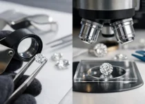
Start with the grading report. For round diamonds, pay close attention to GIA or AGS reports because the measurements are consistent and trusted. Read the proportion section before you get distracted by magnified images or marketing terms.
Next, use the chart to eliminate obvious weak options. If a round diamond has a 60% table and 63.5% depth, or a pavilion angle that drifts too far from strong ranges, move on unless there is compelling visual evidence that it performs well. There are too many good diamonds available online to force a bad set of numbers.
After that, look at the full picture. Check videos, face-up appearance, and if available, light performance images such as ASET or Ideal Scope. Proportions tell you a lot, but they are still a shortcut. Real optical performance matters more than any one measurement.
Finally, compare spread. Spread is how large the diamond looks for its carat weight. If two round diamonds both weigh 1.00 carat, the one with a healthier diameter may offer better visual value. A deep stone can quietly waste your budget.
What a chart cannot tell you
This is where many guides oversimplify the topic. A diamond proportions chart is useful, but it is not a substitute for judgment. It does not tell you everything about symmetry precision, minor facets, painting and digging, or how inclusions affect appearance.
It also becomes less reliable with fancy shapes. For example, you can use general proportion ranges to avoid obvious issues in an oval or cushion, but you still need video to check bow-tie effect, outline appeal, and light return. Fancy shapes are more appearance-driven than numbers-driven.
Even among round diamonds, two stones with similar measurements can perform a little differently. That is why the safest approach is to use proportions as your first screen, not your final decision tool.
Common mistakes buyers make with proportions
One common mistake is chasing the lowest price while accepting weak cut numbers. That usually backfires because a discounted diamond with poor proportions often looks lifeless. Another is obsessing over a single metric, like table percentage, while ignoring the crown and pavilion relationship.
Buyers also get trapped by lab report cut grades alone. An Excellent or Ideal label is helpful, but it does not end the conversation. There is still a range within those grades, and some stones are clearly better balanced than others.
A more subtle mistake is applying round-diamond rules to every shape. A diamond proportions chart for a round brilliant is far more dependable than one for an oval, pear, or emerald cut. With fancy shapes, numbers can only narrow the field.
The smartest way to use proportions without overcomplicating the purchase
You do not need to become a gemologist to shop well. You just need a process that protects you from the most expensive mistakes. Use the diamond proportions chart to filter out weak candidates, then focus your attention on diamonds with strong measurements, credible grading, and clear visual evidence of performance.
If you are comparing similar stones, let cut quality win more often than tiny differences in clarity or color. Most shoppers notice sparkle first. And when you are buying online, sparkle is where smart value usually lives.
A good diamond should not make you feel like you are guessing. The numbers should support the beauty you see, and the beauty should justify the price you pay.